Color plays a huge role in how we perceive things in our everyday lives. Color also dramatically affects one’s feelings, and emotions. Different colors produce different emotional responses in our brain, creating specific feelings in a space. Color sets the tone of a space, having a huge effect on one’s mood, especially in a home setting.
When homeowners work with designers to rework a space, more often than not, they already have ideas for certain fabrics, textures, and furniture pieces in mind. When it comes to picking a color palette, they are completely lost and overwhelmed. Color is one thing most people have no faith in choosing themselves. With virtually infinite options, it is easier to narrow down your selection through the use of color theory. How do you want to feel in the space? How do you want others to perceive the space? Every color on the spectrum has a different psychological effect on the brain, and how you use these colors can make or break a space.
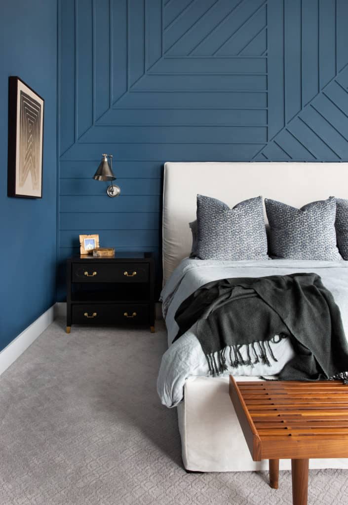
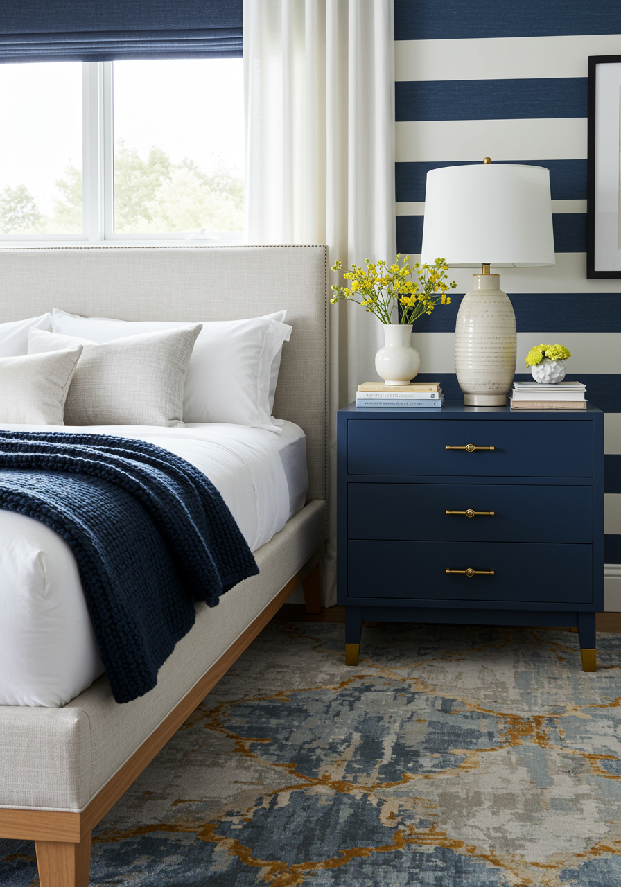
Blue
Colors on the blue side of the spectrum, often referred to as ‘cool colors’, are known to create calm and restful spaces. You may think to use blue in a bedroom, bathroom, or study; places where you would want to relax, wind down, and feel a sense of relief while experiencing the space.
How does this room make you feel while looking at it? Do you feel calm? Could you see yourself sleeping in this room? Blue bedroom walls are associated with serenity. They are proven to promote a better night’s sleep (approximately 7 hours and 52 minutes on average) and a more pleasant awakening. Now imagine this room with red or orange walls. For some people it might work, but that would rarely be a designers first choice.
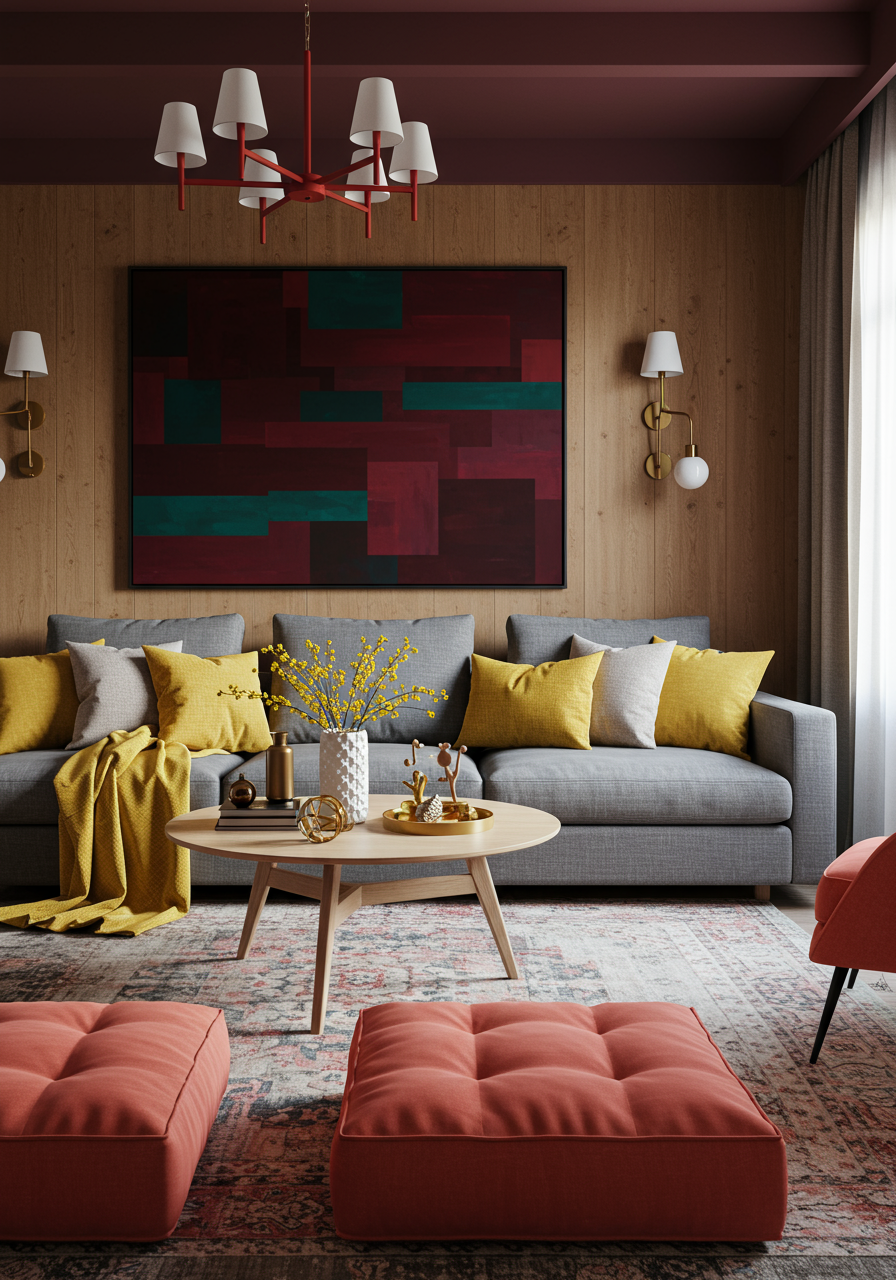
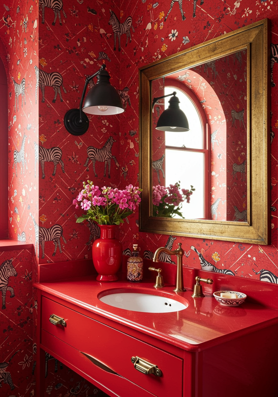
Red
Colors on the red side of the spectrum, ‘warm colors’, are more likely to evoke emotions ranging from warmth and comfort to anger and hostility in a space. You may think to use red in more public spaces of the home such as a game room or family room. These spaces are more high energy, evoking more emotion, excitement, and stimulation.
This living room features subtle yet powerful pops of red used on the chandelier and floor cushions, creating a desirable, energetic feel throughout the entirety of the space. The living room is inviting, exciting, and will create a lively environment for entertaining guests, but be careful to not overdo it when thinking of including red in your own space. Certain shades of red can induce feelings of aggression and rage – two emotions you definitely do not want in an entertaining space of your home.
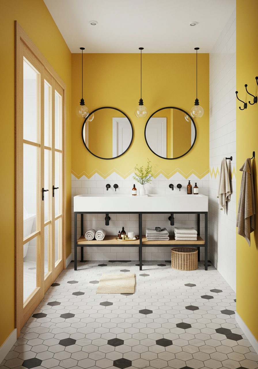
Yellow
You really can’t be in a yellow room without feeling a little joyful! The color yellow translates to happiness, making it a great color to design psychologically. I wouldn’t recommend yellow for a relaxing space such as a bedroom or living room, as this color tends to feel energetic. But, it works stellar in spaces that could use some extra life on their own, such as a bathroom or kitchen.
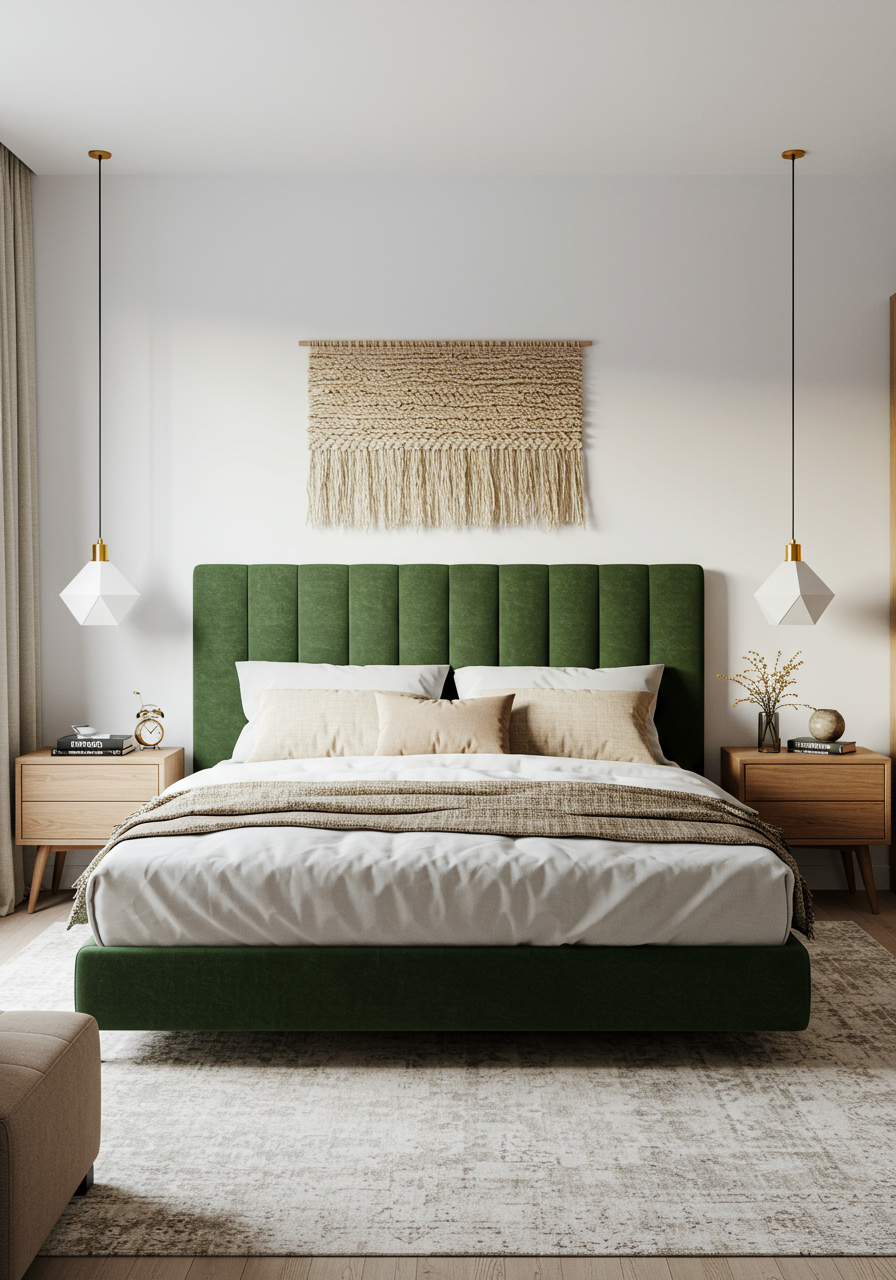
Green
There’s nothing I love more than a beautiful, deep green. This color is known for relieving stress and have a calming effect on individuals; making it a wonderful option for bedrooms, living rooms, anywhere that you want to feel more serene.