Amateur and professional designers alike fall victim to the occasional decorating mistake. From getting a little too excited about every latest fad (to the point where your home decor feels like an ever-evolving trend report) to investing in a too-small area rug to stay on budget, we’ve all been there.
Fortunately, there are a few designer-approved tips you can follow when decorating your home to avoid these common pitfalls — like the
four-to-six-inch curtain rule or the
rug size guide. Being mindful of these simple tricks of the trade can help you create a truly elevated, memorable space.
But first, a disclaimer: as with anything, rules are meant to be broken – particularly when it comes to creating a space that’s personal and unique. As you read on for the common decorating mistakes designers
always notice, and what to do instead, treat it as friendly advice versus concrete dogma. And ultimately, design the home that
you love (
we’re pretty into that idea).
Over-Decorating
There’s an understandable temptation, especially in small spaces, to keep all the furniture and decor you’ve ever owned. This can result in an over-decorated space that feels too cramped and cluttered. Instead, it’s best to edit and pare back — saying goodbye to some pieces will ultimately result in a space that feels calmer, cozier, and more inviting.
Lining the Walls With Furniture
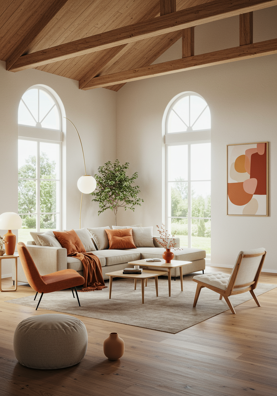
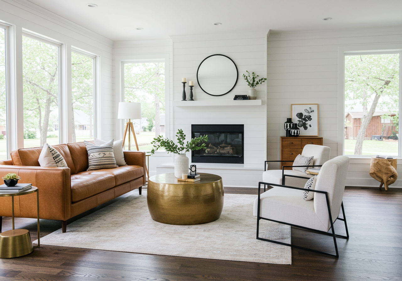
A common design mistake we see often is placing all of the furniture along the walls, leaving the center of the room bare and empty. While it might seem counterintuitive, floating some of the furniture off the walls (particularly pieces like sofas and accent chairs) will actually give the illusion of a larger, more layered, space.
Going All-In on One Design Style
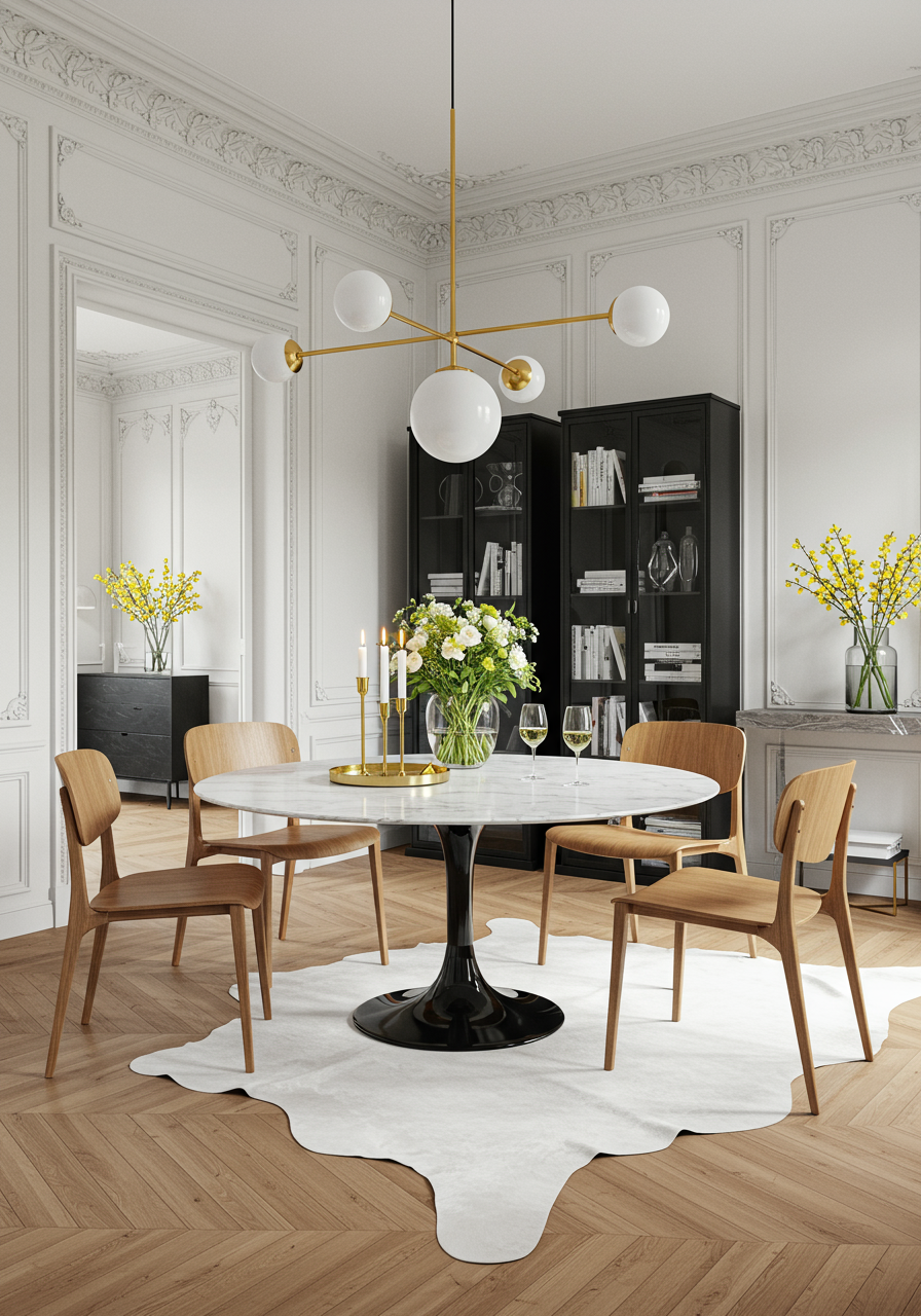
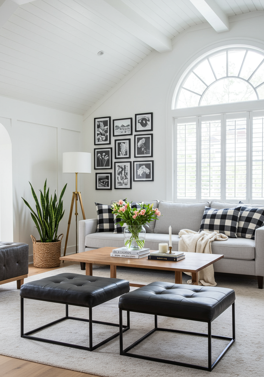
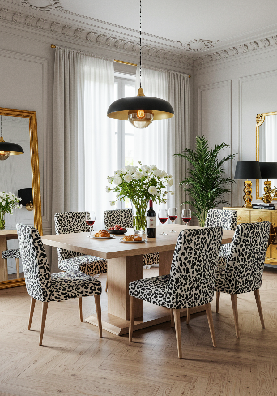
Contrast is critical when trying to create a well appointed, visually arresting space. When a space feels like too much of any one thing — whether it’s all farmhouse, all classic, or all mid-century modern — it can feel boring. Contrast doesn’t just refer to mixing styles, but juxtaposing different colors, shapes, sizes, textures, patterns, finishes, eras, and more. For example, pairing a vintage-inspired round table with a luxe hide rug and a modern, geometric chandelier — the thoughtful mixing and matching makes it sing.
Catalog Cookie-Cutter
If everything in your home came from the same brand and feels lifted straight out of a catalog, that’s a designer no-no. The most interesting spaces include a curation of different elements —purchased, inherited,
discovered, and thrifted. Weave in pieces from different brands, artifacts found locally and while traveling, and special elements that are personal to you, like an heirloom ginger jar from your grandmother or vintage sketches you found on a favorite trip. (
Shameless plug: if you need help sourcing from different places and blending in your history,
we know some Havenly designers who can help!)
Overhead Lighting Only
Relying
only on
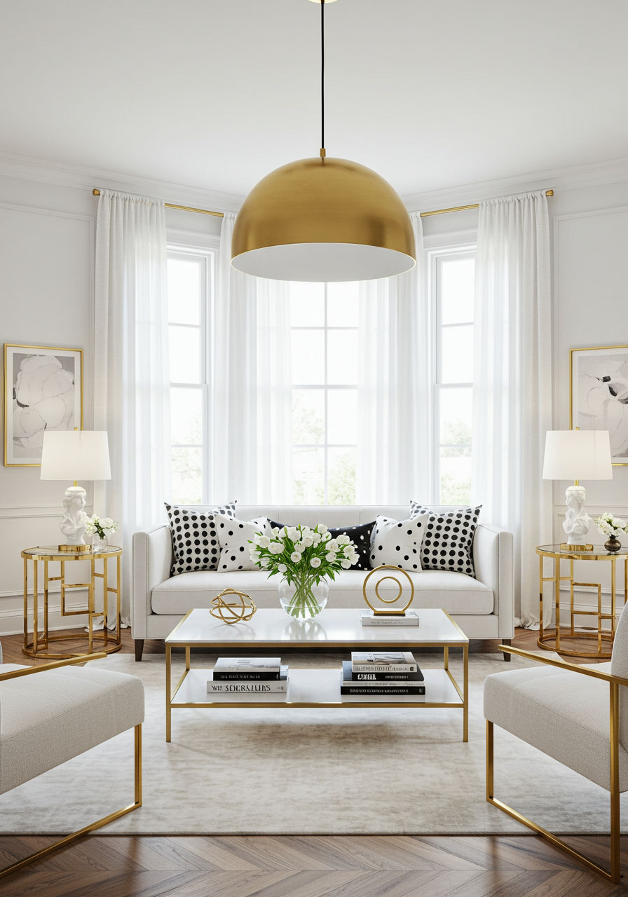
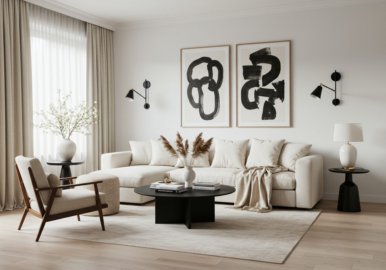
overhead lighting can create a harsh and sterile atmosphere. A designer rule of thumb is layering in at least two to four additional lighting sources in every space, especially in living rooms, where you’ll be both lounging and hosting. Mix
table lamps, floor lamps, and sconces to create a warm and welcoming ambiance.
Hanging Artwork Too High (or Too Low)
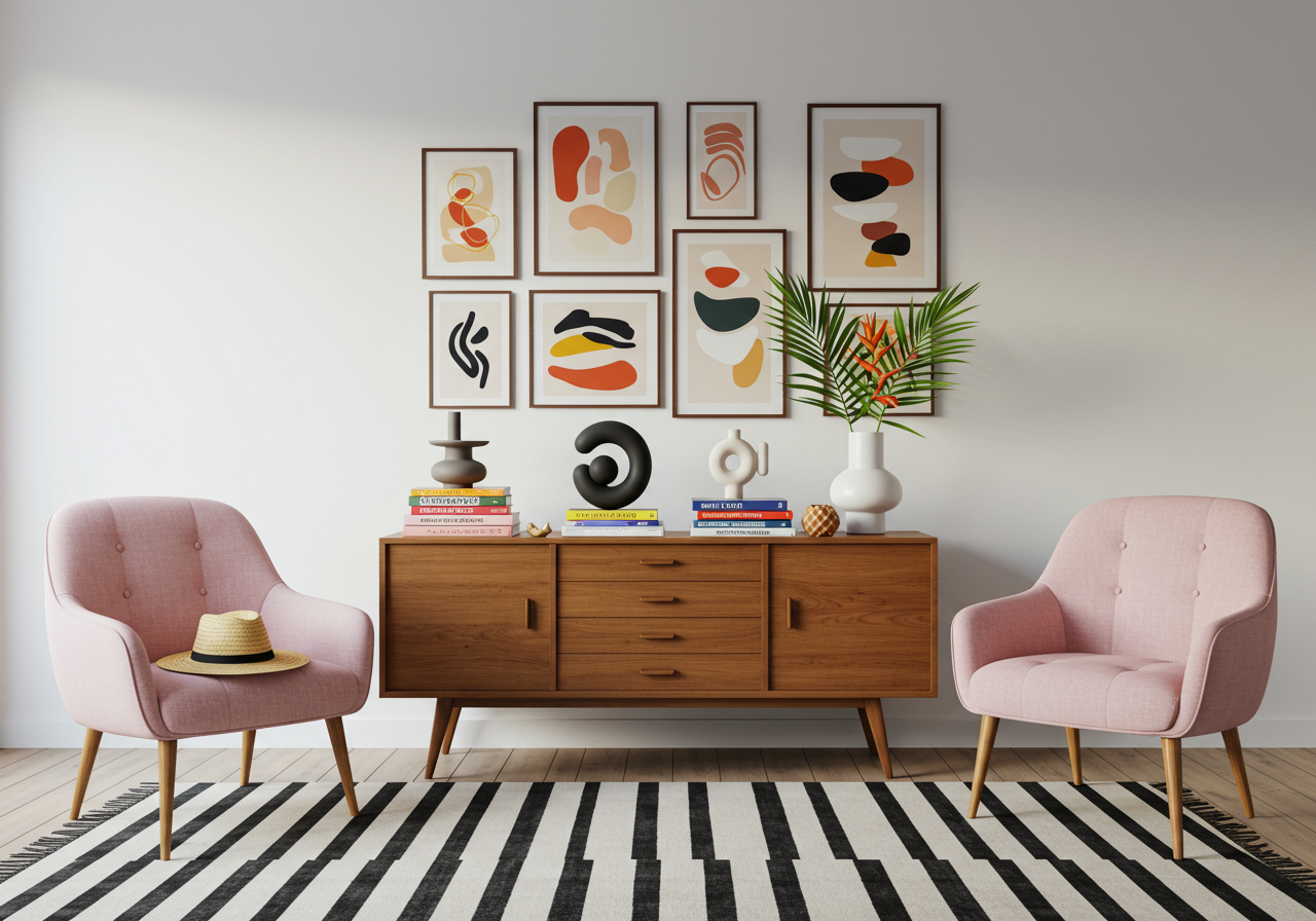
We often find that artwork is hung too high (or sometimes too low), especially when positioned over a piece of furniture, like a sofa or sideboard. The common tendency is to leave a large amount of space between the artwork and the furniture, which makes the piece look like it’s floating, rather than a part of a cohesive vignette. Fortunately, there’s an easy rule of thumb for this: art should typically hang at eye level (of course, there are exceptions to every rule). When in doubt, mind the gap.
Buying a Rug That’s Too Small
We get it — it’s
so tempting to save money and opt for a smaller rug, but in our opinion, this is not the area to skimp. When rugs are too small for a space, the room automatically feels unfinished and bare. It’s better to shop at a more wallet-friendly brand and purchase a rug that’s the appropriate size for your room and your layout, rather than investing in a smaller (but high-end) piece. The
go-to designer rule is to make sure
at least the front legs of all your furniture sit easily on the rug.
Buying Matchy-Matchy Furniture
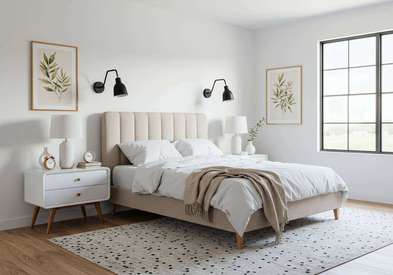
To avoid that furniture superstore vibe, steer clear of matching coffee and accent table sets, or a matching bed-dresser-nightstand combo. Rather, create contrast (remember that tip?) with your furniture by mixing textures, tones, and silhouettes.
Skipping (or Cropping) Curtains
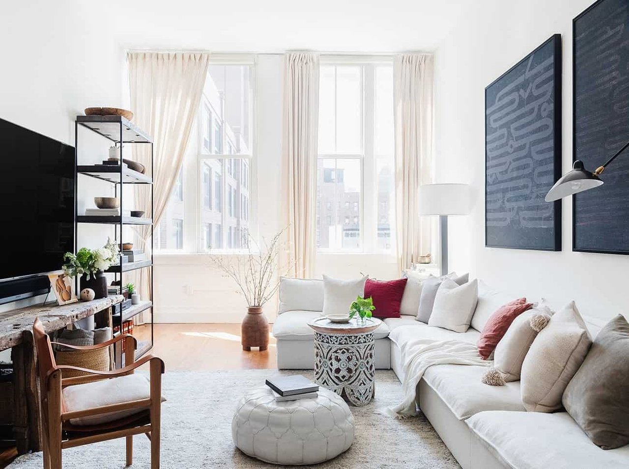
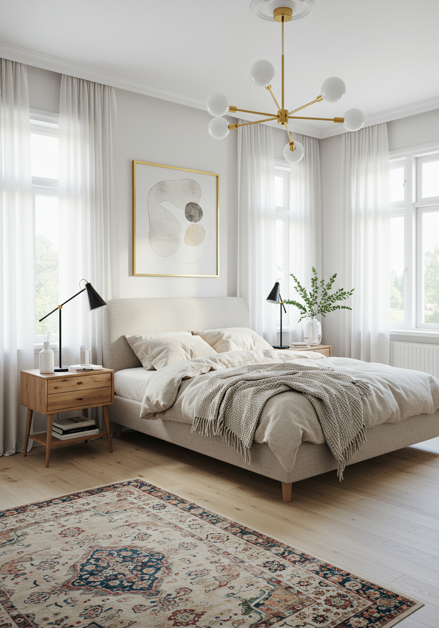
One of the most common small space design mistakes we see involves curtains, or lack thereof. We get it — if you’re tight on space, the last thing you want to do is block out natural light or city views. But curtains are like mascara for a designer — they make a space feel put together and complete. At Havenly, our rule of thumb is to always hang them wide and high: hang the curtain rod four to six inches above the window frame, and extend it outwards so that the curtains are just dusting the sides of the frame. That way, you’re not blocking any precious light. Second, curtains should touch the floor — no ankle crops here. Floor length curtains help create more visual height (particularly in a small space), and draw the eye upward.
Again, there are exceptions to every rule, and if your home boosts noteworthy architecture and statement windows (a la Frank Lloyd Wright style), full permission to ditch the drapes.
Cliche Art
In general, we recommend avoiding generic printed quotes, particularly on wood blocks, that read “Live, Laugh, Love” or “Keep Calm…” You get it. Instead, fill your home with art that holds some meaning to you — whether purchased while traveling, discovered at a local flea market, passed down from a loved one, or simply a scene that makes you feel something. Of course, if the aforementioned word art does that for you, then by all means, go for it! (And we mean that.)
All Neutrals & No Warmth
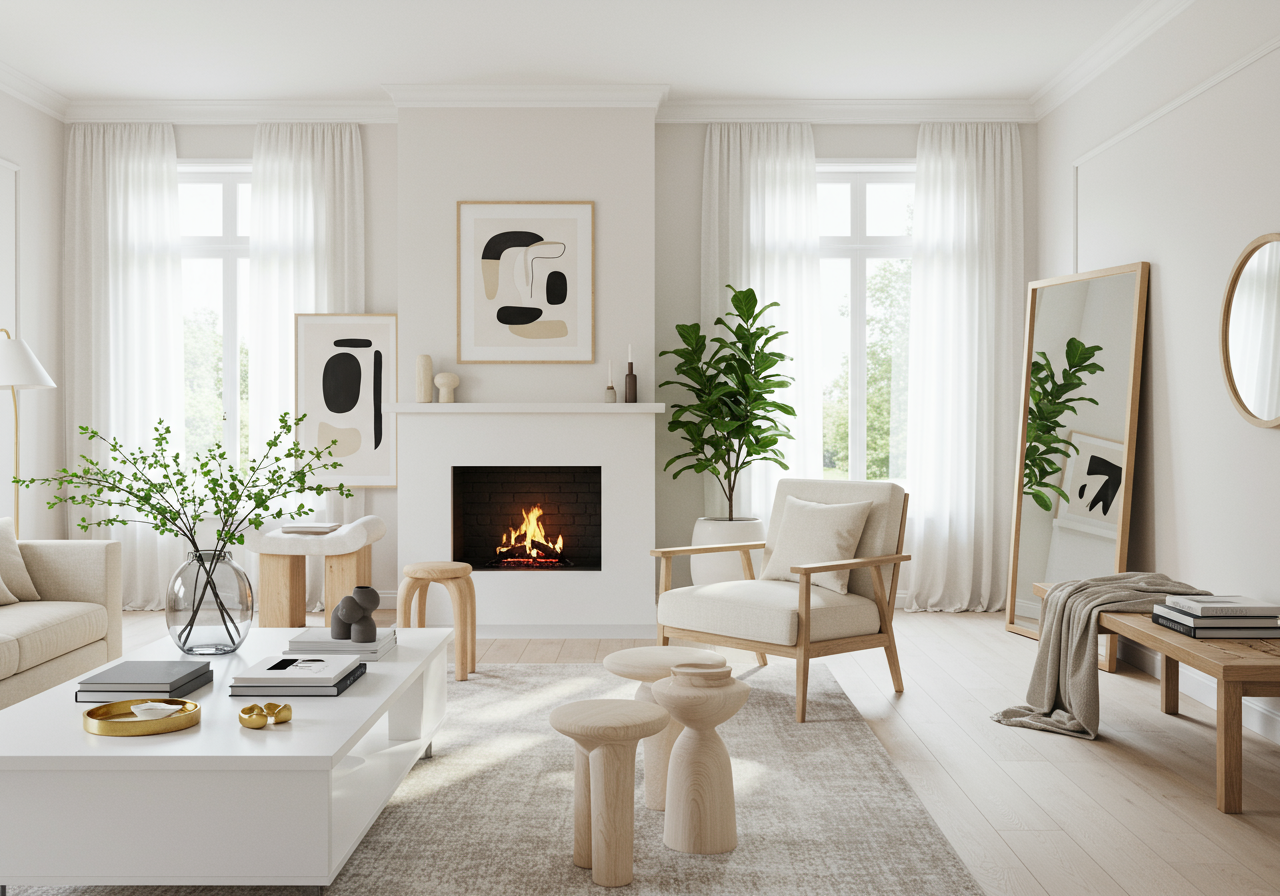
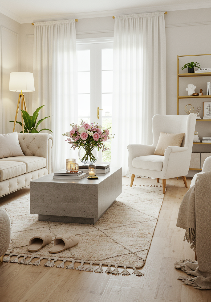
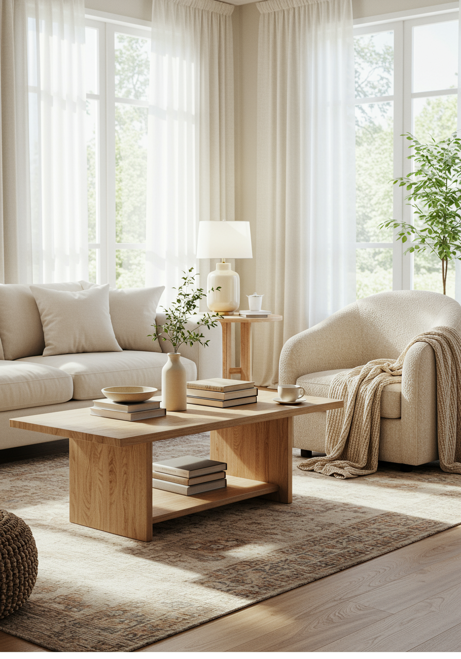
Yes, there’s something serene and sophisticated about a neutral space, but an all-white palette can easily feel flat and unimaginative. If you like the timeless tranquility of neutrals, make sure to add much-needed warmth through contrasting shades of sand, beige, camel, and the like.
Decorating With Faux Flowers
You know the ones we’re talking about — the very stiff and artificial plastic florals commonly found at Hobby Lobby. While there are a lot of elegant and realistic options on the market these days, as designers, we are typically inclined to pass. Bringing in fresh flowers has always been a surefire way to connect a space to the natural world, so consider sticking to the real deal. That said, if longevity is your goal, then consider dried stems for a
Modern Cottage-inspired aesthetic.
Afloral has so many delicate and intriguing options!
Only Adding One Accent Color
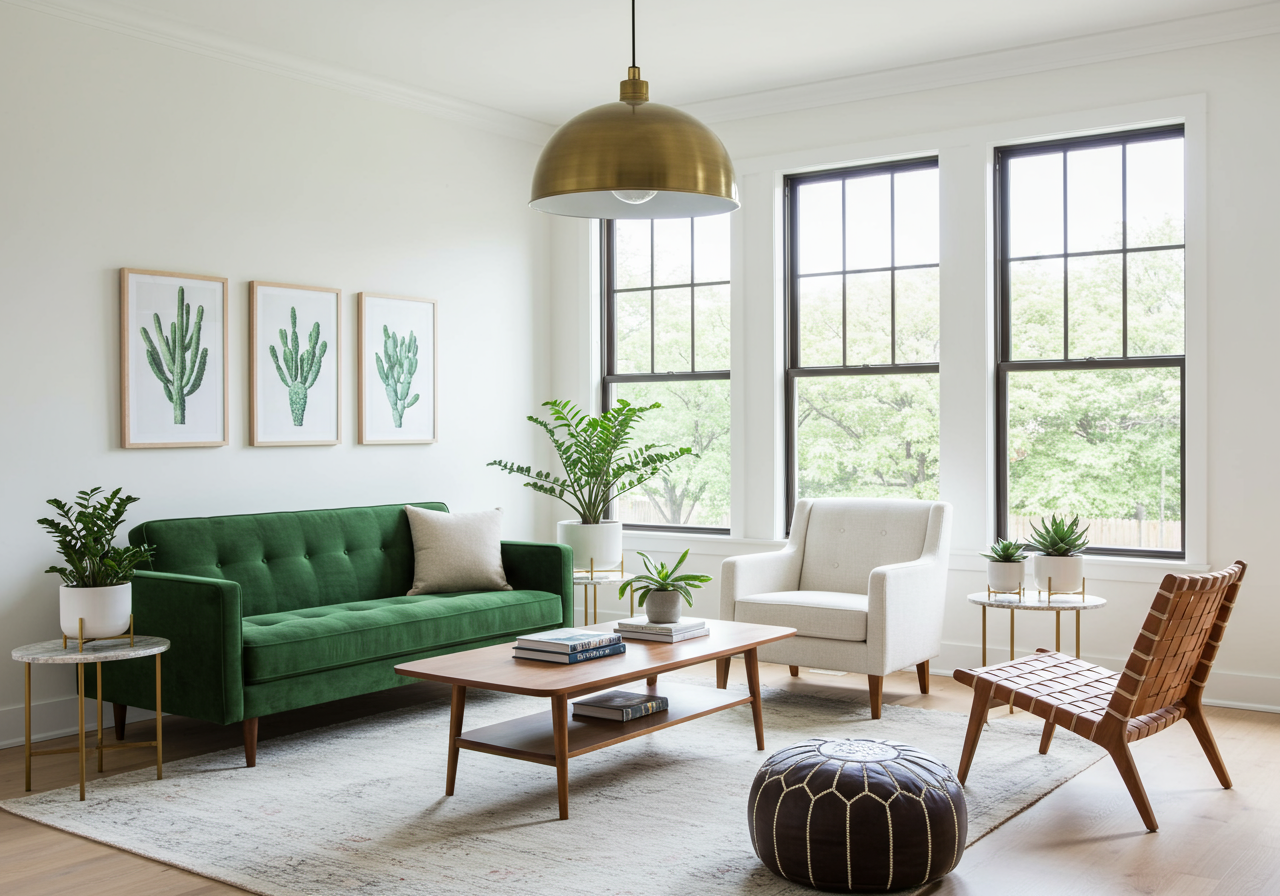
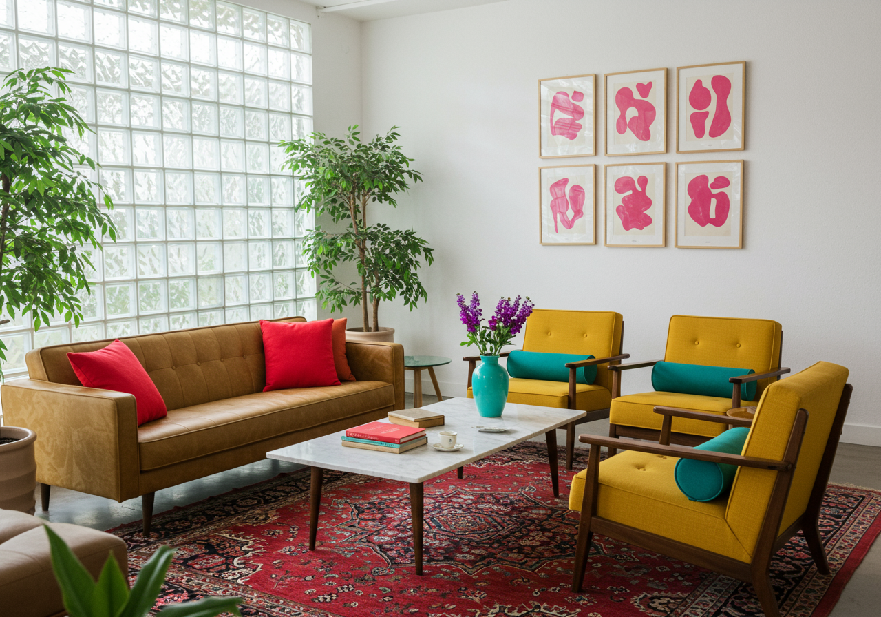
Avoid leaning into one dominant color pop when decorating your space, like buying teal pillows, curtains, and artwork. When designers consider palettes, they artfully weave together a variety of hues. Mixing warm and cool tones, or even multiple shades of a single color, creates a more balanced and intriguing space.
Holding Onto Dated Furniture
Don’t get us wrong — college-era furniture definitely comes in handy once you graduate and start decorating your first space. We all need to start somewhere, both financially and design-wise. But it’s more about knowing when to retire pieces like futons, bean bag chairs, movie posters, and the like. Once you’re financially able, consider upgrading the futon to a more sophisticated daybed, swapping out the posters for artwork that inspires you, and investing in a proper dresser. It’s amazing how switching out a few old pieces can immediately breath new life into a space.
Playing it Safe
At the end of the day, well-designed spaces — the ones that make you think,
Wow, now that’s a home — often involve a little bit of risk-taking. Whether it’s the addition of bold colors or patterns, a statement piece of furniture (we’re into
curves these days), or tackling a
new paint trend, our best advice is to never take design
too seriously. Have fun, play around, try something new. The risk is often worth the reward.
